Please complete the Pre-VTP Survey.
In this Image Analysis + Neuroanatomy Virtual Training Project (VTP), you will use the image analyis software ImageJ and the Python programming language to investigate the evolution of brain anatomy from the fish species astyanax mexicanus, towards the goal of helping us understand the correlation between changes in the size and shape of brain regions and their functions.
Throughout this process, you will learn about image analysis, segmentation, data visualizetion, basic statistics and clustering.
How are the computational/data science skills learned in this project useful?
In case you are thinking, "How could I use this knowledge in real life?", here are several real-world applications of the techniques you will learn:
Research Applications: you can ask interesting questions about fundamental biology that impact our understanding of...
you'll analyze in this VTP comes from, would be an example of this
application.
Clinical Applications: The analysis and interprepation of complex imaging data is frequently performed in the clinic. For example, in the field of radiology, skills learned in this VTP can be applied to enhance diagnostic accuracy by identifying subtle patterns or changes in MRI or CT scans that might otherwise be missed. In addition, this skillset is fundamental to developing and interpreting predictive models for patient outcomes, which can aid in personalized treatment planning.
Biotech/Industry Applications: Biotechnology and pharmaceutical industries heavily rely on the ability to analyze and interpret data. The image analysis skills learned in this VTP can be applied to drug discovery, where they can be used to analyze cellular responses to potential drugs. Segmentation techniques can help identify specific biological structures within an image, and clustering methods can be used to classify cells or other biological entities based on their visual properties. In the industry setting, data visualization and statistical skills are also key to effectively communicate findings to stakeholders and guide decision-making processes.
Tech applications: The skills learned in this VTP also have wide-ranging applications in the technology sector. Machine learning and AI technologies heavily rely on data analysis, and image analysis skills can be particularly valuable in areas like computer vision. For example, segmentation and clustering techniques can be used to develop algorithms for autonomous vehicles to identify and classify objects in their environment. Data visualization skills can also be used to communicate complex data in an accessible way, and are thus critical in various tech sectors from data science to product management.
In a broader sense, the skills you'll learn are a subdivision of data science. We'll point out data science principles as we go along.
The source of the data you will analyze in this VTP is from the research study A brain-wide analysis maps structural evolution to distinct anatomical modules, which explores the evolution of brain anatomy in the blind Mexican cavefish, using advanced imaging techniques to analyze variations in brain region shape and volume and investigate the influence of genetics in brain-wide anatomical evolution.
The brain's overall topology remains highly conserved across vertebrate lineages, but individual brain regions can vary significantly in size and shape.
Novel anatomical changes in the brain are built upon ancestral anatomy, leading to the development of new regions that expand function and functional repertoire.
There are two main ideas about how the brain evolves:
The first hypothesis suggests that different parts of the brain tend to evolve together. This means that selection acts on mechanisms that control the growth of all regions of the brain at the same time.
The second hypothesis proposes that selection can also act on individual brain regions. According to this idea, regions of the brain that have similar functions will change together in their anatomy, even if other brain regions are not affected.
Volume and shape govern anatomical variation, but it is unclear if similar or distinct mechanisms drive these parameters, and their relationship is poorly understood.
Anatomical differences in the brain are influenced by both its volume (size) and shape, but scientists are not sure yet if they are controlled by the same or different mechanisms.
Most studies tend to focus on either volume or shape separately, and few compare both together.
The current organismal systems researchers have used to study how volume and shape influence brain evolution face some challenges, such as lack of genetic divsersity or experimental tools, which makes it difficult to investigate the fundamental principles of how the brain evolves.
The blind Mexican cavefish provides a powerful model for studying genetic variation's impact on brain-wide anatomical evolution due to its distinct surface and cave forms with high genetic diversity.
Hybrid offspring between surface and cave populations allow the exploration of genetic differences and the identification of genetic underpinnings of neuroanatomical evolution.
A brain-wide neuroanatomical atlas was generated for the cavefish, and computational tools were applied to analyze volume and shape changes in brain regions.
Associations between naturally occurring genetic variation and neuroanatomical phenotypes were studied in hybrid brains, revealing genetically-specified regulation of brain-wide anatomical evolution.
Brain regions exhibited covariation in both volume and shape, indicating shared developmental mechanisms causing dorsal contraction and ventral expansion.
Selection may be operating on simple developmental mechanisms that influence early patterning events, modulating the volume and shape of brain regions.
[Methods Overview]
Throughout this VTP, you will...
Here's a flowchart of the analysis you'll perform:
All bioinformatics tasks will be performed in "the cloud" on your own Amazon Web Services (AWS) hosted high performance compute instance.
What is cloud computing:
For this project, you will execute tasks using either Fiji or Python on you cloud computing high-performance compute instance through your browser.
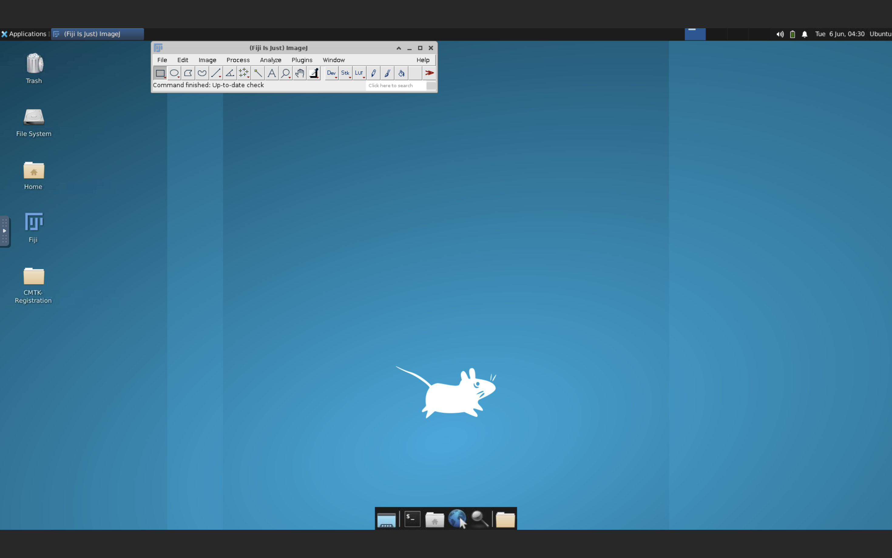
Fiji Fiji is an open-source software package widely used for scientific image analysis and processing. It provides a user-friendly interface and numerous tools for tasks like image filtering, segmentation, and measurement. Fiji is based on another software called ImageJ and includes many plugins and extensions to enhance its functionality. Fiji stands for "Fiji is ImageJ".
Here's what Fiji will look like using the URL we've provided you:
Python Python is a popular programming language known for its simplicity and versatility. It is widely used in data science and scientific research and has extensive support for various scientific libraries and tools. Python provides a flexible and intuitive syntax, making it easier for scientists and researchers to write code for data analysis, machine learning, and image processing tasks.
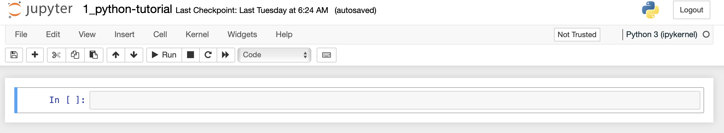
You will run the python code in a Jupyter Notebook. Jupyter Notebook is an interactive computing environment where users can create and share documents containing live code, visualizations, and explanatory text. It allows for the execution of code in cells, enabling iterative development and easy testing. With support for multiple programming languages, Jupyter Notebook is widely used for data analysis, scientific research, and education. It also facilitates the creation of interactive visualizations and allows documents to be saved and shared in various formats, promoting collaboration and reproducible research.
Here is what the Python (Jupyter Notebook) dashboard looks like:
The URLs and passwords to access Fiji and Python can be found in the Getting Started section.
Observe, Replicate, and Apply: During this analysis, you'll initially witness the analysis performed on an Example Sample. Subsequently, replicate that step with the same sample to confirm you achieve identical results. Afterward, apply this procedure to your assigned sample(s) that you can find in the Getting Started section.
Focus on Understanding, not Coding Syntax: Some steps necessitate the execution of code. However, our primary goal isn't teaching you programming languages but to ensure you grasp the fundamentals of inputs, parameters, outputs, and the interpretation of these outputs. For better comprehension, consider each step as a mathematical function (e.g., y = mx + b): no matter how complex a block of code appears, you are always inputting data and receiving output.
Mathematics is a Tool, not a Barrier: Certain steps will call for the use of complex mathematical functions to manipulate data. We understand you may not have a deep understanding of the underlying mathematics, but our focus is to understand the purpose and outcome of each step at a high level. Comprehending the input, the general function of the step, the output, and how to interpret and use the output is what's crucial.
Here's a step-by-step tutorial on Image Segmentation and Quantification based on the video "FIJI for Quantification: Cell Segmentation" presented by Dr. Paul McMillan of the Biological Optical Microscopy Platform at the University of Melbourne.
Objective To perform cell segmentation using FIJI/Image J. We will turn a fluorescence image into a segmented image where each individual cell has been individually segmented.
Materials Needed
A computer with FIJI/Image J installed, and the fluorescence image file located on the Desktop in a folder called Segmentation-Tutorial.
(Reminder: the URL to the cloud instance with FIJI can be found in Getting Started)
First, watch the video of Dr. McMillan, then perfrom the steps on your assigned Fiji instance.
Cell.tifVideo
Open the Fluorescence Image
Duplicate the Image
Identify Each Cell on "Cell.tif"
Noise Tolerance, but in your version of Fiji it's called Prominance; (2) exact point number you will get is similar to, but not exactly the same as the video due to different versions of Fiji used)Define the Area of All the Cells on the duplicated image "Cell-1.tif"
Combine "Mask_1.tif" and "Mask_2.tif"
Clean Up the Image
Analyze the Data
Remember, the specific values used in this tutorial (such as the threshold value of 388 and the filter value of 250 pixels squared) are specific to this analyzed image. When you're doing this with, you might need to adjust these values based on your specific image and what you're trying to achieve. Don't be afraid to experiment and see what works best for your data!
Please upload screenshots of the following into your Google Sheet:
In this training project, you will execute each step with an Example Sample and then your own assigned sample (Found in the Getting Started).
[Background/Rationale]
Surface_0416_TH_001_01.nii.gzManually segment the Pallium (Pa) brain region in sample Surface_0416_TH_001_01.nii.gz`:
Manually segment the assigned brain region from a single 2D image in the confocal stack of your assigned sample.
Takeaways:
In the Google Sheet, please:
Upload a screeenshot of the segmented example sample
Upload a screeenshot of the your segmented sample
Upload a screeenshot of the measurement results for the example sample
Upload a screeenshot of the measurement results for your assigned sample
Linux is a command-line based operating system. For our purposes Linux = Unix.
The next step of this project is partly performed in Linux. Linux is a powerful operating system used by many scientists and engineers to analyze data. Linux commands are written on the command line, which means that you tell the computer what you want it to do by typing, not by pointing and clicking like you do in operating systems like Windows, Chrome, iOS, or macOS. The commands themselves are written in a language called BaSH.
Here's a brief tutorial that covers some concepts and common commands using a sample code.
Concepts
Command Line
The Linux command line is a way of interacting with the computer's operating system by typing in commands in a text-based interface. It's a bit like talking to your computer using a special language, and that language is called Bash.
The command line in the Terminal tab should look something like this:
(base) your-user#@your-AWS-IP-address:~
$
(base) your-user#@your-AWS-IP-address:~
$ linux-commands-are-typed here
(base) your-user#@your-AWS-IP-address:~ $
Using the command line is different than using a graphical user interface (GUI) because instead of clicking on icons and buttons to interact with your computer, you type in text commands. It can take some time to learn the commands and syntax of the command line, but once you do, you can often do things faster and more efficiently than with a GUI. Some people also prefer using the command line because it gives them more control over their computer's settings and can be more powerful for certain tasks.
Let's type a command in the command line.
List the files and directories in the current directory using the ls command:
ls
You should see something like this output to the screen:
It looks like a lot, but don't fret, this is just a bunch of files and directories (i.e. folders). You'll notice the Terminal colors by their type. For example, directories are colored blue. A directory is computer-science speak for a folder. So this tells you what folder you are currently sitting in.
Directory
As we have mentioned, a directory is another name for a folder in which files are stored.
If you look immediately to the left of the $, you will see what is called the "working directory". The ~ symbol has a special meaning in Linux systems: it refers to the home directory on your system.
Navigate to the CMTK_Analyses directory using the cd command.
cd ~/CMTK_Analyses/
After you execute the command, your command line should look like this:
(base) user2@ip-172-31-25-174:~/reads
$
Now, use the ls command to list the files and directories in this directory:
ls
You should see something like this`:
Now, let's say you need to go back to the home ~ directory:
cd ~
You should once again be back in the home ~ directory. It should look like this:
(base) your-user#@your-AWS-IP-address:~
$
Now, go back to the CMTK_Analyses directory.
cd CMTK_Analyses
Sometime we need to create a new directory to store files around a project, like when you create a new folder on your computer.
Let's create a new directory called test_directory in the current directory using the mkdir command.
mkdir test_directory
Execute ls to confirm that the test_directory directory was indeed created.
Enter the test_directory directory.
cd test_directory
Your terminal should look like this:
(base) user2@ip-172-31-25-174:~/CMTK_Analyses/test_directory
$
Return to the ~/CMTK_Analyses directory:
cd ~/CMTK_Analyses
List the last last 15 commands run in your terminal so you can submit it in the next checkpoint:
history 15
There's a lot more that we could cover about working with the Linux command line, but this is enough to get started with your bioinformatics analysis.
In the Google Sheet, please:
X
Y
Z
In this research, they're trying to measure and compare the size and shape of different regions in the brains of various fish. Manually doing this for each brain region in each fish would be incredibly time-consuming, as you've just experienced, and possibly less accurate due to human error.
So, the researchers used image registration as an automation tool to streamline and enhance the accuracy of this process. By creating a "standard" or reference brain image (think of it as a template), they could align each individual fish's brain image to this template using image registration.
Once all the images are aligned to the standard brain, they could automate the measurement process. The software can recognize and measure the same region across all aligned images because it 'knows' where to look based on the standard brain. This saves a lot of time and enhances the precision of measurements, allowing for more accurate comparisons of brain structures among the fish.
So, image registration in this case plays a crucial role in both automating and increasing the accuracy of the complex task of measuring brain regions, thus enabling the researchers to focus on their primary objective: understanding the evolution of brain structure in these fish.
Run CMTK Registration
name_of_sampleRun CMTK on example sample
munger_2023-06-11_06.13.15.sh CMTK Registration scriptThis script is used for a registration process with the Computational Morphometry Toolkit (CMTK). This toolkit provides a suite of command line tools, and it is often used in bio-imaging research to perform tasks such as image registration, which aligns different sets of data into one coordinate system. Here is what each part of the script does:
#!/bin/sh: This line tells the system to use the Bourne shell (sh) to execute the script.
# 2023-06-11_06.13.15: This line is a comment, as indicated by the # at the beginning. It's a timestamp of when this script was created or last modified.
cd "/home/ubuntu/Desktop/CMTK-Registration"
The next line executes the munger tool from CMTK, located at the specified path:
"/home/ubuntu/Fiji.app/bin/cmtk/munger"
This specifies the base directory for CMTK tools:
-b "/home/ubuntu/Fiji.app/bin/cmtk"
These are parameters for the munger tool, including settings for alignment, warping, and the type of transformation used for registration:
-a -w -r 010203 and -X 26 -C 8 -G 80 -R 4
-A '--accuracy 0.4' -W '--accuracy 0.4'
This sets the number of threads used by munger:
-T 1
-s "refbrain/SPF2_021921_010_01.nrrd"
This specifies the target image to which the source will be registered:
images/Surface_0416_TH_001_01.nrrd
Run CMTK on your assigned image sample.
In the Google Sheet, please:
X
Y
Z
[Background/rationale]
name_of_sampleGenerate volumetric data by region on Example Sample using CMTK or CobraZ (?)
Generate volumetric data by region on Assigned Sample using CMTK or CobraZ (?)
In the Google Sheet, please:
X
Y
Z
For the next set of steps, we'll use the Python Programming Language.
Python Programming Tutorial for High School Students
Part 1: Introduction to Python
Python is a high-level, interpreted, and general-purpose dynamic programming language that focuses on code readability. The syntax in Python helps the programmers to do coding in fewer steps as compared to Java or C++.
Part 2: Basics of Python
2.1 Python Variables and Data Types
In Python, variables are created when you assign a value to it. Python has various data types including numbers (integer, float, complex), string, list, tuple, and dictionary.
# Defining variables in Python
a = 10              # integer
b = 5.5             # float
c = 'Hello World'   # string
2.2 Python Operators
There are various operators in Python such as arithmetic operators (+, -, , /, %, *, //), comparison operators (==, !=, >, <, >=, <=), and logical operators (and, or, not).
# Python operators
a = 10
b = 20

print(a + b)  # output: 30
print(a > b)  # output: False
Part 3: Python Conditional Statements and Loops
3.1 If Else Statement
Python supports the usual logical conditions from mathematics. These can be used in several ways, most commonly in "if statements" and loops.
# Python if else statement
a = 10
b = 20

if a > b:
    print("a is greater than b")
elif a == b:
    print("a is equal to b")
else:
    print("a is less than b")
3.2 For Loop
A for loop is used for iterating over a sequence (that is either a list, a tuple, a dictionary, a set, or a string).
# Python for loop
fruits = ["apple", "banana", "cherry"]

for x in fruits:
    print(x)
3.3 While Loop
With the while loop we can execute a set of statements as long as a condition is true.
# Python while loop
i = 1
while i < 6:
    print(i)
    i += 1
Part 4: Python Functions
A function is a block of code which only runs when it is called. You can pass data, known as parameters, into a function. A function can return data as a result.
# Python function
def my_function():
    print("Hello from a function")

my_function()  # calling the function
In the Google Sheet, please:
X
Y
Z
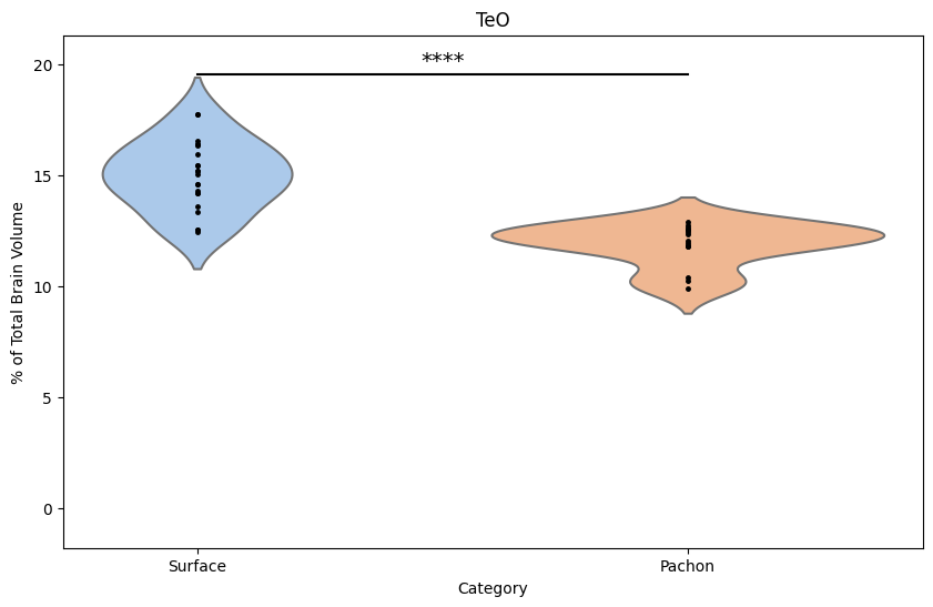
In this study, the researchers asked: "Is there a significant difference in the size (volume) of specific brain regions between surface-dwelling fish, cave-dwelling fish, and their hybrids?" This question is trying to find out whether evolution has led to significant changes in brain structure.
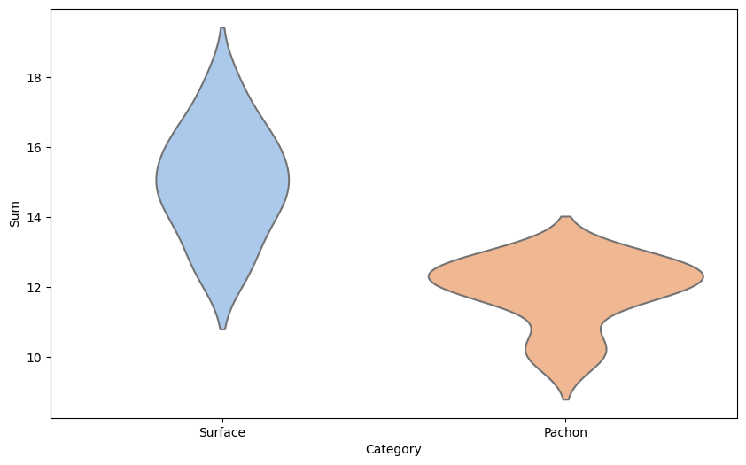
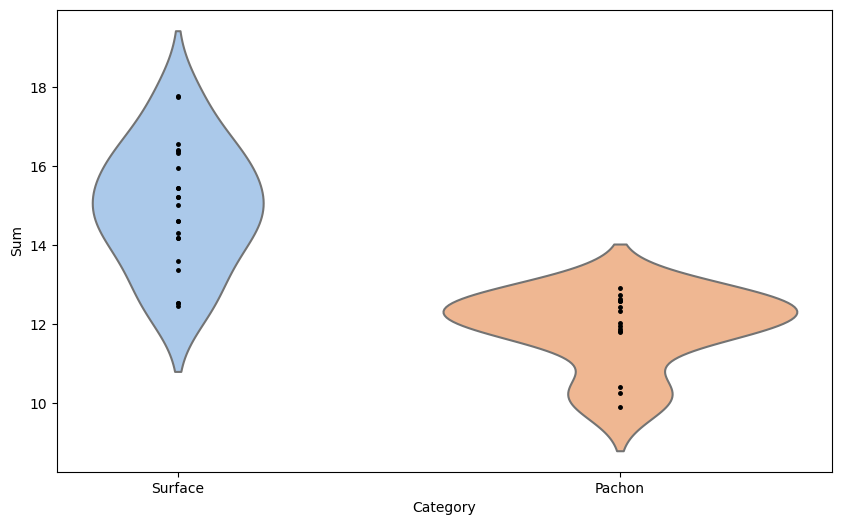
Violin Plots: To get a preliminary idea about the answer, the researchers could use violin plots. A violin plot is like a snapshot of a symphony. Just like a symphony has many different notes, each fish type (surface, cave, or hybrid) has many individual fish, each with slightly different brain sizes. A violin plot helps visualize all these 'notes' at once.
It does so by showing the distribution of brain sizes. For instance, the widest part of the 'violin' might represent the most common brain size for that fish type, and the narrow parts represent sizes that are less common. By comparing the shapes of these violins, researchers can get a visual sense of whether and how brain sizes differ among the fish types.
T-tests: But visuals, while helpful, aren't enough to scientifically confirm a difference. That's where the t-test comes in. It's like a judge at a race, objectively determining who's faster. In this case, the 'race' is between the average brain sizes of different fish types.
The t-test compares these averages and determines whether any observed differences are significant or if they could just be due to random chance. For example, if the t-test shows a significant difference in average brain size between surface fish and cave fish, that would support the idea that evolution (life on the surface vs. in a cave) has indeed led to changes in brain structure.
So, to recap, the researchers would first use violin plots to visually inspect the data and get an initial idea of any differences, and then use t-tests to statistically confirm these differences.
Let's generate Violin Plots and t-tests to explore differences in brain region volume between surface and cave fish.
Optic TectumCreate violin plots to compare volumetric distributions of brain regions in Surface vs. Pachon fish.
The example sample is the Optic Tectum, or TeO for short.
Open 2_brain-volume-distribution.ipynb, paste and run each code block below into it's own cell:
#load libraries:
import pandas as pd
from scipy.stats import ttest_ind
import matplotlib.pyplot as plt
import seaborn as sns
Output: if step runs properly, you should not see any output on the screen.
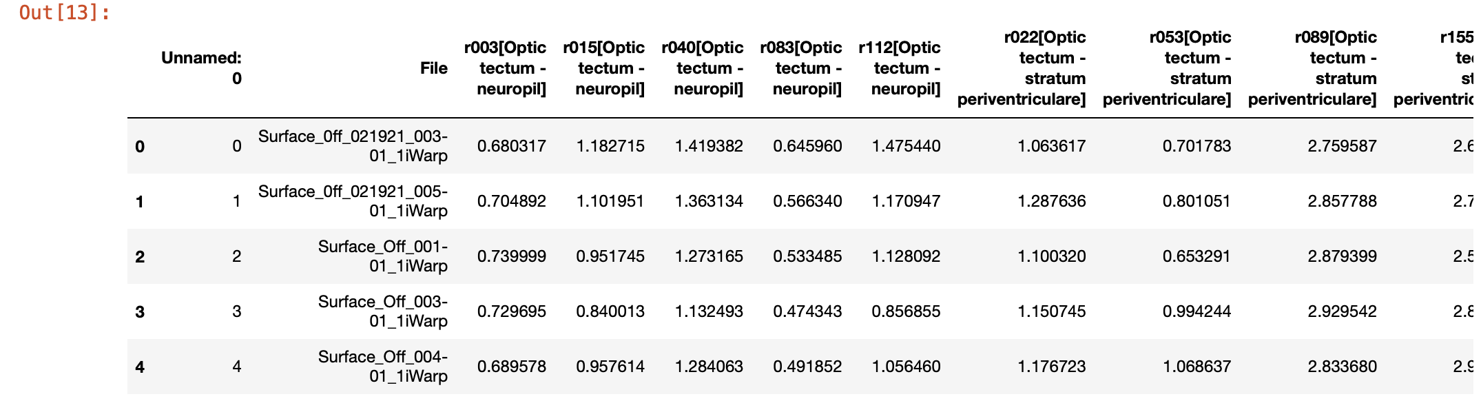
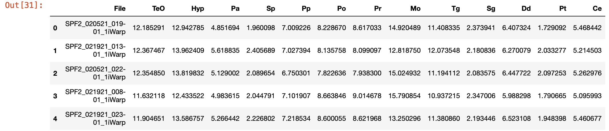
# Load the new data
teo_data = pd.read_csv('./TeO.csv')

# Display the first few rows of the dataframe
teo_data.head()
# Create a new 'Category' column based on the 'File' column
teo_data['Category'] = teo_data['File'].apply(lambda x: 'Surface' if 'Surface' in x else 'Pachon')
Output: if step runs properly, you should not see any output on the screen.
# Perform a two-sample Student's t-test for 'TeO'
surface_data = teo_data[teo_data['Category'] == 'Surface']['Sum']
pachon_data = teo_data[teo_data['Category'] == 'Pachon']['Sum']
t_stat, p_val = ttest_ind(surface_data, pachon_data)
print(t_stat)
6.938755257652403
print(p_val)
Output:
4.5836532064433305e-08
# Create a mapping of p-value to significance indicator
if p_val < 0.0001:
    sig_indicator = '****'
elif p_val < 0.001:
    sig_indicator = '***'
elif p_val < 0.01:
    sig_indicator = '**'
elif p_val < 0.05:
    sig_indicator = '*'
else:
    sig_indicator = ''
# Create the violin plot (without points, p-value, title, y-axis label)
plt.figure(figsize=(10, 6))
sns.violinplot(x='Category', y='Sum', data=teo_data, inner=None, palette="pastel")
# Create the violin plot (with points)
plt.figure(figsize=(10, 6))
sns.violinplot(x='Category', y='Sum', data=teo_data, inner=None, palette="pastel")

# Overlay the datapoints
for category in ['Surface', 'Pachon']:
    category_data = teo_data[teo_data['Category'] == category]
    plt.plot([0 if category == 'Surface' else 1]*len(category_data), category_data['Sum'], 'k.', markersize=5)

# Show the plot
plt.show()
# Create the violin plot (with points, p-value, title, y-axis label)
plt.figure(figsize=(10, 6))
sns.violinplot(x='Category', y='Sum', data=teo_data, inner=None, palette="pastel")

# Overlay the datapoints
for category in ['Surface', 'Pachon']:
    category_data = teo_data[teo_data['Category'] == category]
    plt.plot([0 if category == 'Surface' else 1]*len(category_data), category_data['Sum'], 'k.', markersize=5)


# Add a horizontal line and significance indicator if the p-value is significant
if sig_indicator:
    ymax = teo_data['Sum'].max()
    plt.plot([0, 1], [ymax + 0.1*ymax, ymax + 0.1*ymax], 'k-')
    plt.text(0.5, ymax + 0.12*ymax, sig_indicator, ha='center', fontsize=14)
    plt.ylim(-0.1*ymax, ymax + 0.2*ymax)

# Set the title and labels of the plot
plt.title('TeO')
plt.ylabel('% of Total Brain Volume')

# Show the plot
plt.show()
Output:
Now recreate this analysis for your assigned sample. In the template script below,
Replace 'Your_File.csv' with the name of your data file.
replace your_sample_data with the name of your sample. for example, if you're assigned the Tegmentum (Tg, your_sample_data would be changed to tg_data
# Load the new data
your_sample_data = pd.read_csv('./your_sample.csv')

# Display the first few rows of the dataframe
print(your_sample_data.head())
# Create a new 'Category' column based on the 'File' column
your_sample_data['Category'] = your_sample_data['File'].apply(lambda x: 'Surface' if 'Surface' in x else 'Pachon')
# Perform a two-sample Student's t-test for your_sample
surface_data = your_sample_data[your_sample_data['Category'] == 'Surface']['Sum']
pachon_data = your_sample_data[your_sample_data['Category'] == 'Pachon']['Sum']
t_stat, p_val = ttest_ind(surface_data, pachon_data)
print(t_stat)
print(p_val)
# Create a mapping of p-value to significance indicator
if p_val < 0.0001:
    sig_indicator = '****'
elif p_val < 0.001:
    sig_indicator = '***'
elif p_val < 0.01:
    sig_indicator = '**'
elif p_val < 0.05:
    sig_indicator = '*'
else:
    sig_indicator = ''
# Create the violin plot (without points, p-value, title, y-axis label)
plt.figure(figsize=(10, 6))
sns.violinplot(x='Category', y='Sum', data=your_sample_data, inner=None, palette="pastel")
# Create the violin plot (with points, p-value, title, y-axis label)
plt.figure(figsize=(10, 6))
sns.violinplot(x='Category', y='Sum', data=your_sample_data, inner=None, palette="pastel")

# Overlay the datapoints
for category in ['Surface', 'Pachon']:
    category_data = your_sample_data[your_sample_data['Category'] == category]
    plt.plot([0 if category == 'Surface' else 1]*len(category_data), category_data['Sum'], 'k.', markersize=5)

# Add a horizontal line and significance indicator if the p-value is significant
if sig_indicator:
    ymax = your_sample_data['Sum'].max()
    plt.plot([0, 1], [ymax + 0.1*ymax, ymax + 0.1*ymax], 'k-')
    plt.text(0.5, ymax + 0.12*ymax, sig_indicator, ha='center', fontsize=14)
    plt.ylim(-0.1*ymax, ymax + 0.2*ymax)

# Set the title and labels of the plot
plt.title(your_sample_file.replace('.csv', ''))  # Use the filename as the title, minus the .csv extension
plt.ylabel('% of Total Brain Volume')

# Show the plot
plt.show()
In the Google Sheet, please:
X
Y
Z
In this next step, we will use hierarchical clustering to see if certain neuroanatomical regions group together by brain volume
Hierarchical clustering Hierarchical clustering is a way of grouping similar things together. Imagine you have a bunch of different kinds of fruits. How would you group them? You might put all the apples together, all the oranges together, and all the bananas together.
Now, hierarchical clustering is a bit more sophisticated. Instead of just putting similar things together, it also looks at how similar the groups are to each other.
So, you might group apples and oranges together into a "tree fruits" group and bananas into a "tropical fruits" group. Then, you can make a bigger group that includes both "tree fruits" and "tropical fruits" groups and call this "fruits".
This method creates a hierarchy, or a sort of family tree, of groups, starting with the individual items at the bottom (like different kinds of apples), and ending with the most inclusive group at the top (like "fruits").
In the world of data science, hierarchical clustering can help us understand the relationships between lots of different pieces of data, not just fruits. We use it when we want to understand the structure of our data and how all the pieces relate to each other.
This is a simplified explanation, but we hope it gives you a good basic understanding!
How hierarchical clustering is used in this study
This study aims to understand how the anatomy of the brain evolves using a specific fish species, Astyanax mexicanus, which has both surface-dwelling and cave-dwelling forms. As we've discussed, the researchers created a detailed map, or atlas, of the fish's brain, then used computational tools to measure and compare the shape and size of each identifiable region of the brain across different populations of the fish.
Hierarchical clustering is really useful in this context. To understand why, let's revisit our fruit analogy. Imagine if, instead of clustering fruits, you're clustering different fish based on their brain structures. If certain regions of the brain are more similar among fish of the same type (surface-dwelling, cave-dwelling, or hybrids), these fish might cluster together in our analysis.
So, how does it work in this study? By measuring different regions of the brain and their variations, the researchers can use hierarchical clustering to group the fish not only by type (surface, cave, or hybrid) but also by similar patterns of brain anatomy. This allows them to uncover relationships between different brain regions, like finding that dorsal (top) regions are shrinking while ventral (bottom) regions are expanding.
This hierarchical clustering provides a way to visualize and understand these complex relationships. It's like building a family tree, but for fish brains!
It also helps the researchers to identify potential driving forces behind these changes. For example, the study suggests that similar developmental mechanisms might be causing both the changes in size and shape of the brain regions. This is like noticing that all the apples in your tree fruit group are red; it might lead you to investigate why that is.
In conclusion, hierarchical clustering is used by these researchers to better understand the intricate ways in which the brains of these fish are evolving.
Here you will perform hierarchical clustering. First you're reproduce hierarchical clustering with 15 samples, then you'll repeat the step with a sample of 25 fish, and ultimately all 39 fish.
This will help you see how the clustering robustness changes as you increase the amount of data that you cluster.
The example sample is the Optic Tectum, or TeO for short. Execute step with n = 15 Example Sample Dataset
Open 3-1_example-sample_correlation-heatmap-clustering.ipynb, paste and run each code block below into it's own cell:
# Import necessary libraries
import pandas as pd
import numpy as np
# Load the data again
brain_region_data = pd.read_csv('./SPF2samples_15.csv')

# Display the first few rows of the dataframe
brain_region_data.head()
Output:
# Import seaborn for the heatmap plot
import seaborn as sns
import matplotlib.pyplot as plt
# Remove the 'File' column as it's not a numerical feature
brain_region_data_numeric = brain_region_data.drop(columns='File')

# Get correlation matrix and plot
corr_mat = brain_region_data_numeric.corr().to_numpy()
corr_mat[np.isnan(corr_mat)] = 0  # casting nan values to zero correlation

plt.figure(figsize=(10, 10))
sns.heatmap(corr_mat, annot=False, cmap='coolwarm',
            xticklabels=brain_region_data_numeric.columns,
            yticklabels=brain_region_data_numeric.columns)

plt.title("Correlation Matrix of Brain Regions")
plt.show()
https://milrd.org/wp-content/uploads/2023/06/corr_plot_heatmap.png
# Import scipy for clustering
from scipy.cluster import hierarchy as spc
# Cluster
pdist = spc.distance.pdist(corr_mat)
linkage = spc.linkage(pdist, method='complete')
idx = spc.fcluster(linkage, 0.5 * pdist.max(), 'distance')

# Get cluster vector
cluster_vector = np.argsort(idx)

# Restructure correlation matrix
corr_mat_clustered = corr_mat[:, cluster_vector][cluster_vector, :]

# Plot clustered heatmap
plt.figure(figsize=(10, 10))
sns.heatmap(corr_mat_clustered, annot=False, cmap='coolwarm',
            xticklabels=brain_region_data_numeric.columns[cluster_vector],
            yticklabels=brain_region_data_numeric.columns[cluster_vector])

plt.title("Clustered Correlation Matrix of Brain Regions")
plt.show()
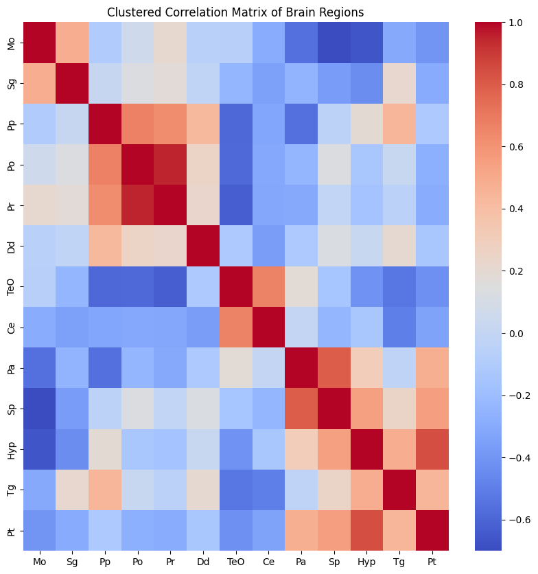
Now, execute step with:
1. 25 SPF2 samples (SPF2samples_25.csv) in 3-2_your-sample_correlation-heatmap-clustering_25-samples
2. All 39 SPF2 samples (F2_brain_regions.csv) in 3-3_your-sample_correlation-heatmap-clustering_all-samples
For ease, here is the code with a your_input_file.csv placeholder for your file input.
# Import necessary libraries
import pandas as pd
import numpy as np
# Load the data again
brain_region_data = pd.read_csv('./your_input_file.csv')

# Display the first few rows of the dataframe
brain_region_data.head()
# Import seaborn for the heatmap plot
import seaborn as sns
import matplotlib.pyplot as plt
# Remove the 'File' column as it's not a numerical feature
brain_region_data_numeric = brain_region_data.drop(columns='File')

# Get correlation matrix and plot
corr_mat = brain_region_data_numeric.corr().to_numpy()
corr_mat[np.isnan(corr_mat)] = 0  # casting nan values to zero correlation

plt.figure(figsize=(10, 10))
sns.heatmap(corr_mat, annot=False, cmap='coolwarm',
            xticklabels=brain_region_data_numeric.columns,
            yticklabels=brain_region_data_numeric.columns)

plt.title("Correlation Matrix of Brain Regions")
plt.show()
# Import scipy for clustering
from scipy.cluster import hierarchy as spc
# Cluster
pdist = spc.distance.pdist(corr_mat)
linkage = spc.linkage(pdist, method='complete')
idx = spc.fcluster(linkage, 0.5 * pdist.max(), 'distance')

# Get cluster vector
cluster_vector = np.argsort(idx)

# Restructure correlation matrix
corr_mat_clustered = corr_mat[:, cluster_vector][cluster_vector, :]

# Plot clustered heatmap
plt.figure(figsize=(10, 10))
sns.heatmap(corr_mat_clustered, annot=False, cmap='coolwarm',
            xticklabels=brain_region_data_numeric.columns[cluster_vector],
            yticklabels=brain_region_data_numeric.columns[cluster_vector])

plt.title("Clustered Correlation Matrix of Brain Regions")
plt.show()
Take note:
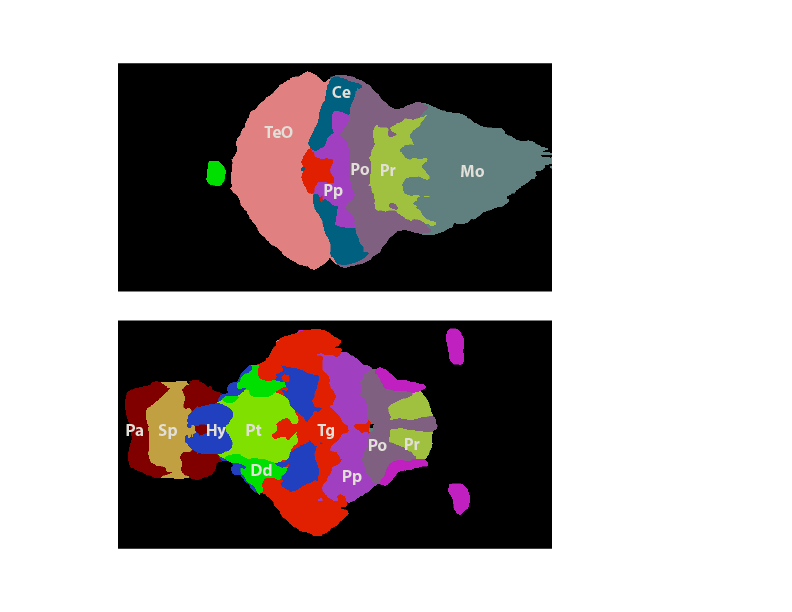
You should have found three clusters from you analysis with all 39 samples in the previous section.
Cluster1: Hyp, Sp, Pp, Tg, Sg, Pt
Cluster2: TeO, Po, Pr, Mo,
Cluster3: Pa, Dd
Here's an illustration of how the regions from each cluster map to the brain:
So, at this point,
Please complete the Post-VTP Survey.